Four we can talk about honestly
Sizes, weeks and what went sideways. If a project is only shown from its best angle, you are looking at an advertisement, not a portfolio.
Selected work
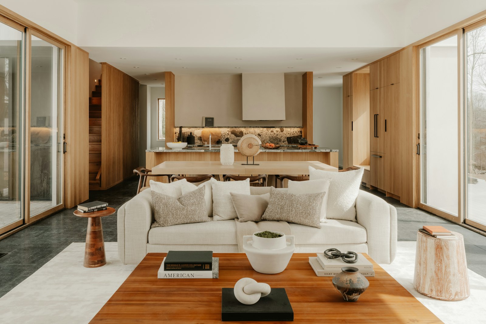 Užupis apartmentTwo proper rooms and a hallway, from three rooms nobody could use.Three small rooms and a corridor you had to turn sideways in, turned into two proper rooms and a hallway you can put a coat in.58 m²Size11 weeksOn sitewithin 10%Estimate heldSee the project
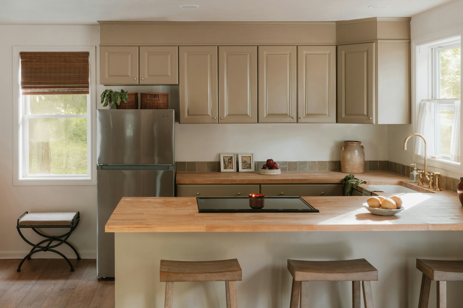 Žvėrynas kitchenSame footprint, twice the storage.A 1970s kitchen treated as a wall of cupboards instead of a room: same four walls, twice the storage.14 m²Size6 weeksOn site2× beforeStorageSee the project
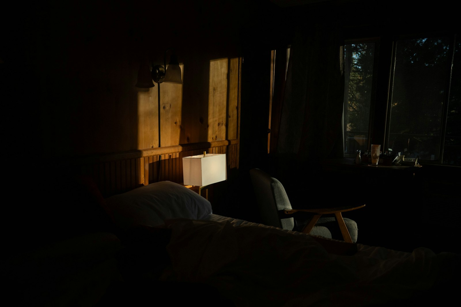 Antakalnis bedroomEverything they own, behind one line of doors.Everything a couple owns behind one line of doors: a bedroom and a storage wall done in four weeks while they lived in the flat.22 m²Size4 weeksOn sitethroughoutLived inSee the project
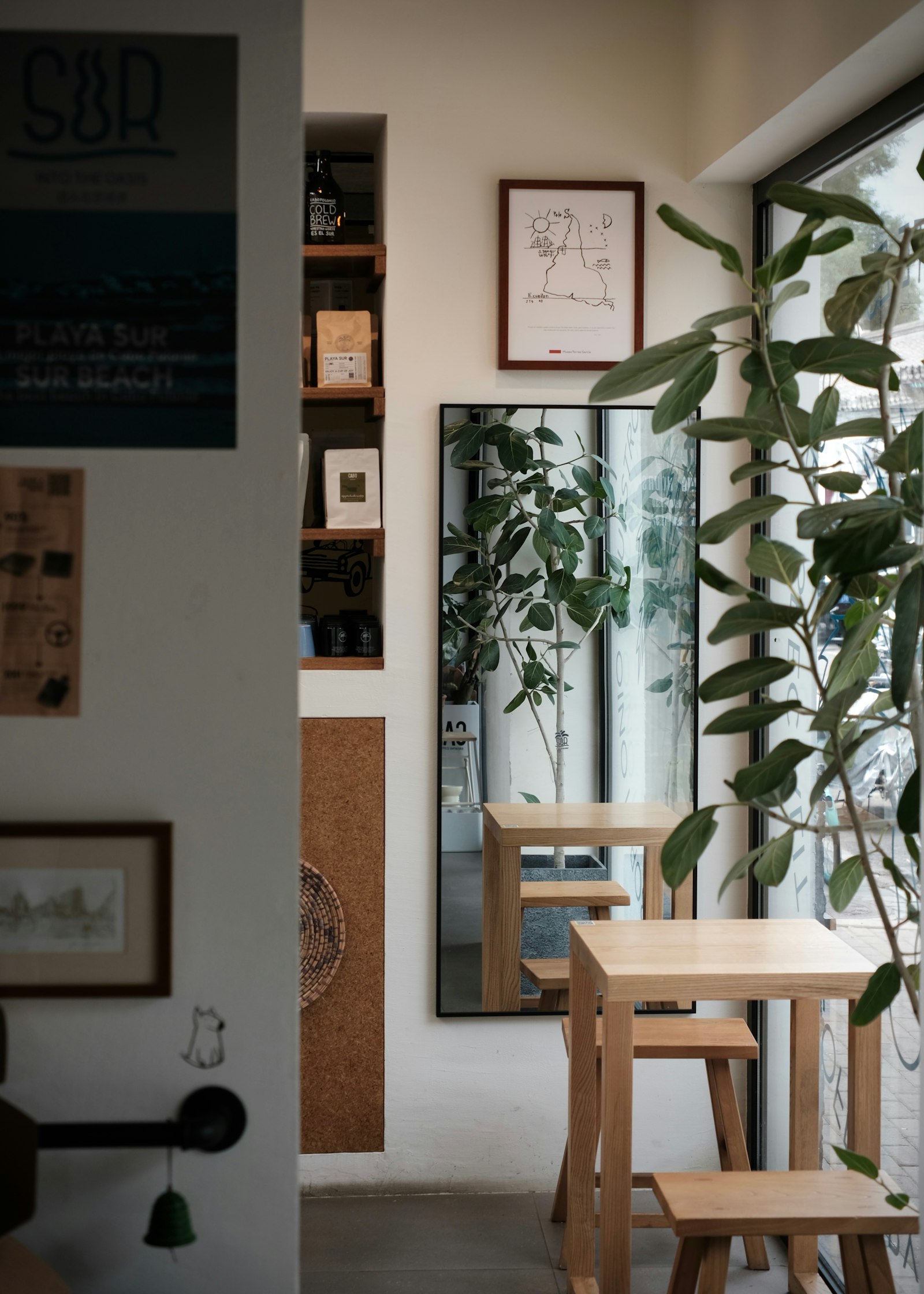 Café PirmaOpen a week before the lease said it had to be.A small café built around a lease that started in three months, finished a week early.40 m²Size7 weeksOn sitea week earlyFinishedSee the project
- 38
- flats and spaces since 2016
- 11
- weeks, the average full renovation
- 2
- people you will actually deal with
- 10%
- how far the estimate usually moves
Yours could be the fifth
Send a photo and a floor plan if you have one. Two hours at your place costs €180 and answers most of it.